The CSS Box Model
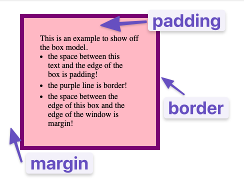
The CSS Box Model is a fundamental concept in CSS that describes how elements are structured and styled. It consists of four components:
- Content: The actual text or image content of the element.
- Padding: The space between the content and the element’s border.
- Border: The border that surrounds the content and padding.
- Margin: The space outside the border.
Before we dive into the details, let’s take a look at real example…
Dev Tools
Being able to inspect and debug your HTML and CSS is critical to frontend development. Here, we will go through the Chrome Dev Tools, which allow you to see detailed information about your elements and CSS rules, as well as assist you in finding and fixing problems in your code.
If you’re not using Chrome, you can use other browsers like Firefox or Edge in a similar way, but your view may look slightly different.
To open up the inspector, you can right-click on any element of a webpage and click “Inspect” or press F12. Go ahead and do that right now to see the HTML and CSS used on this page.
Get started by right-clicking here and selecting “Inspect” to see the HTML and CSS used on this page.
Don’t get overwhelmed with all the tools you’re now seeing! For this section, we want to focus on the Elements and Styles panes.
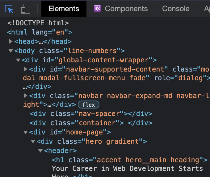
The Elements Pane
Within the Elements pane, you can see the HTML structure of the page, and the CSS classes that are applied to each element.
You can click on any of the elements in this pane to select that specific element. Alternatively, you can click the blue-highlighted icon shown below on the left, and hover over any element on the page.
The Styles Pane
When an element is selected, the Styles tab will show all the currently applied styles, as well as any styles that are being overwritten (indicated by a strikethrough of the text).

Exploring the Dev Tools
You can also directly edit elements and styles using this tool, which is useful for testing out quick changes to a page. One of the best ways to learn is by doing, so go ahead and make some changes to the styles or content of this page using the dev tools. Explore, get creative, get silly, and have fun!
If you want to reset your changes, you can just refresh the page. You’re only editing your browser’s copy of the page, not the actual page you’re viewing.
Aside: The Importance of the Basics
Now that you understand the basic syntax of HTML and CSS, we’re going to get serious. The most important skills you need to master with CSS are positioning and layout. Changing fonts and colors is a crucial skill, but being able to put things exactly where you want them on a webpage is even more crucial.
Learning to position elements on a webpage is not that difficult once you understand just a few key concepts. Unfortunately, many learners race through learning HTML and CSS to get to JavaScript and end up missing these fundamental concepts. This leads to frustration, pain, (and funny gifs) because all the JavaScript skills in the world are meaningless if you can’t stick your elements on the page where you need them to be. So with that in mind, let’s get started.
The Box Model
The first important concept that you need to understand to be successful in CSS is the box model. It isn’t complicated, but skipping over it now will cause you much frustration down the line.
Every single thing on a webpage is a rectangular box. These boxes can have other boxes in them and can sit alongside one another. You can get a rough idea of how this works by sticking a border on every item on the page like this:
* {
  border: 1px solid red;
}
The * is a universal selector that targets every element on the page. This is a quick way to see how the boxes are laid out on the page.
Want to get an idea of what this would look like on this page? We’ve got you covered.
Cool? Overwhelming? In the end, laying out a webpage and positioning all its elements is deciding how you are going to nest and stack these boxes.
The only real complication here is that there are many ways to manipulate the size of these boxes, and the space between them, using padding, margin, and border. To sum it up briefly:
paddingincreases the space between the border of a box and the content of the box.marginincreases the space between the borders of a box and the borders of adjacent boxes.borderadds space (even if it is only a pixel or two) between the margin and the padding.
You can also inspect this yourself on a per-element basis using the dev tools. Just head over to the Computed tab next to the Styles tab and you can see the box model for any element on the page.
A Video Walkthrough of the Box Model
Because the box model concept is so incredibly fundamental, let’s dig a bit deeper with this video from Web Dev Simplified.
Additional Resources: MDN
Mozilla Developer Network (MDN) also has a comprehensive guide to the box model that covers everything we’ve talked about so far. We highly recommend you check it out!